Object-Oriented CSS: Buttons
Object-oriented CSS is an important skill and way to think when writing the class structure for websites today. The idea behind object-oriented CSS is to write basic styles that work in conjunction with each other to form the styles behind a single element. The best practice is to identify elements that are used throughout a website like news articles, inputs, or other elements and then apply unifying classes so that you can style them once and apply it throughout the project.
Buttons have been a fixture of web pages since the early days of the web. As website designers focus on usability more and more, buttons are both becoming nicer looking and more prevalent. Because they are being used more and more, and users are expecting even simple anchor tags to be styled like them, buttons are a perfect use-case to practice object-oriented CSS.
The look of many HTML elements, especially form elements, is based on both the operating system and browser of the user. We'll be starting today's quick tip with some normalized CSS in order to set some consistencies in browsers.
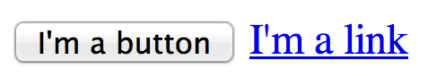
Since we want to be able to style both real submits and regular anchor links, but we don't want to style every link like a button, we'll set up a button class to target all elements which should look like the button we're creating. This button class should have all of the basic parts of a button, it might look something like the following code:
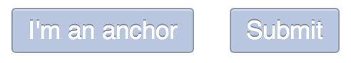
<a href="#" class="button">I'm an anchor</a>
<input type="submit" class="button" value="I'm a button" />
.button{
  padding: 5px 10px;
  margin: 10px;
  display: inline-block;
  text-decoration: none;
  background: #b8c6df;
  color: #fff;
  box-shadow: 0 1px rgba(255,255,255,.4) inset;
  text-shadow: 0 -1px rgba(0,0,0, .3);
  border: 1px solid #8f9aad;
  border-radius: 3px;
}
There are some very important part of the preceding style which are necessary to pulling the look off, the first of which is "display: inline-block." This allows the elements to take space like they were block level, but also flow like they are inline.
You may also notice that the box-shadow and text-shadow properties are set as RGBA values. Setting them this way allows us to change the background color and not need to recalculate the values. This will be extremely important in a minute.
The rest of the properties should be pretty straightforward. Setting a border and border-radius help users identify its role as a button.
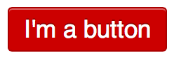
Now this is where the real power of object-oriented CSS comes in. Say we come across a reason to have a red button on the website? Now we need to copy all of the styles to a new selector right? Nope! With the addition of a single class, we can have another great looking button.
<a href="#" class="button red">I'm a button</a>
.button.red{
  background: #c00;
  border: 1px solid #a00;
}
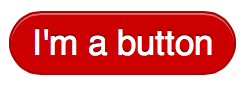
You're probably already thinking about ways which you can use the power of object-oriented CSS to its full potential. I'll leave you with one last example: a pill-shaped button.
<a href="#" class="button red pill">I'm a button</a>
.button.pill{
  border-radius: 1000px;
}
As you can see, going about CSS in an object-oriented manner can make your code much more streamlined by combining common snippets under unifying classes. Unifying classes can save download times, increase ease of maintenance, and help keep consistent styling across your entire website. Be sure to write me with any questions or if you have some great examples of object-oriented CSS.
All code from today's quick tip can be found at CodePen.io.
- css
- html